When I heard the 15%-16% (WHO estimate), I was a bit surprised. However, if we think about it, it’s not uncommon for someone to have difficulties with one of their senses or even cognitive functions. For example, many people’s vision deteriorates with age. In such cases, one solution might be to zoom in on the page, but something as small as text not adapting to the screen size can make reading significantly harder. After all, you have to scroll back to the beginning of each line.
More serious conditions present from birth or caused by illness are even harder for many to imagine. For example, due to a severe motor dysfunction, a person might only have access to two large buttons to interact with a website. In such cases, it really matters how well the site supports easy navigation. With accessibility, even those who previously did not have the opportunity to do so can connect to the world.
Accessibility is not “edge-case development”, it can improve the usage to everyone. Examples include looking at a reflective mobile screen in bright light or when you can only navigate with one hand because the other is busy or damaged.
It is also worth knowing as a developer or designer that in the EU, all public sector websites are required to comply with accessibility guidelines ((EU) 2016/2102).
Tools to test our website
Tab, Enter, Space
One of the simplest tests is to navigate through the website using the tab key. By pressing tab, we move through the focusable elements on the page. With Enter and Space we can activate clickable functionalities. This can reveal, for example, if our hamburger menu is not focusable because it was not created as a button and does not have a tabindex. People with significant visual or motor impairments do not use a mouse. Often, they can rely on only a few keys while using a screen reader.
Screen readers
On Mac devices, the VoiceOver application is available by default. When launched, it reads the screen aloud and helps reveal if important information is missing. For example, if we used an icon as a button but did not assign any “title” or “label” to indicate what the button does. For Windows users, the NVDA software can be downloaded for free. Mobile phones also have screen readers (VoiceOver, TalkBack).
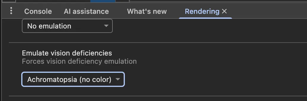
Rendering tab of Chrome developer tools
If you don’t know how to open it, you can search for the term rendering with “Command + Shift + P”. Here, for example, using the Emulate vision deficiencies section, you can see how your site looks with different types of visual impairments. Chrome also has an Accessibility tab, which can be useful.
Lighthouse in Chrome
The accessibility of the site can be tested by running Lighthouse, and we receive feedback on what should be improved. However, it’s worth noting that if an element that is logically important is not focusable, it may not be flagged because it is treated as decorative. Therefore, it does not replace manual testing.
aXe extension
There is both a Chrome extension and a VS Code plugin. Opinions are mixed, but it can be useful for pointing out issues. The plugin highlights obvious omissions.
Suggestions for developers
- Keep in mind that screen readers follow the HTML order, not the visual layout on the screen. With CSS tricks we can move anything anywhere, but if it is not in the correct place in the DOM, the logical order breaks.
- It’s an old story, but try to use semantic tags. If we want to create a button, style the button tag instead of a div. Even if we make it focusable with a tabindex, it will not automatically become clickable. Additionally, screen readers have quick navigation menus that allow jumping between elements like different h tags.
- Maintain a proper heading hierarchy when using h tags. Don’t jump from h1 directly to h4 just because you don’t want large text. Instead, style the h2.
- Use landmarks like: main, nav, header, footer.
- Always provide either a ‘title’ or an ‘aria-label’ for standalone icons.
- For form elements, always associate the label with the input
- aria-labelledby can be used to reference a description for a non-text element. For example, if an image title is in a p tag with an id, this id should be assigned to the image’s aria-labelledby attribute.
- Check whether using tab navigation takes you outside the visible screen. For example, after a hamburger menu, you might press tab multiple times without seeing any focused element because, although the menu is not open, tab still moves through its items.
- Do not remove the “outline” unless you handle focus states differently, for example using the :focus-visible pseudo-class.
- Add tabindex=0 to elements that should be focusable but are not, but do not use higher values as it is an anti-pattern.
- If your navigation contains many elements, provide a “skip link” that allows users to jump directly to the content.
- Ensure that text always fits within the screen and does not require horizontal scrolling.
- Sites should work on 200% zoom level.
- Use alt text for images.
- Using the axe-core npm package, we can write automated tests focused on accessibility
- Familiarize yourself with ARIA properties and keep in mind that they only add semantic meaning to elements; they do not affect behavior or focusability. Aria is a fallback, not the solution. Prefer native html.
- Regularly check your website using the tools above and fix any issues that arise. Today, we don’t need to memorize every syntax because solutions are easy to find. However, identifying the problem is still our responsibility.
- Place alert elements immediately after the opening body tag so they can be more easily found by assistive technologies. If it is not critical, use aria-live=“polite” so that the alert is not too intrusive.
- When opening a modal, trap focus inside and return focus when closed.
- Use helpful validation messages and clearly indicate what is required or optional.
- Specify the language of the site:
<html lang="en"> - Too much animation can cause dizziness or cognitive overload, consider turning them off according to preferences:
    @media (prefers-reduced-motion: reduce) {
        animation: none;
    }
Suggestions for designers
- Clickable elements should not be too small or too close to each other, so they don’t require perfect motor precision to use. (Minimum size: 44 x 44 px)
- Important control elements should be placed at the top of the page so users don’t have to navigate through the entire page to reach them. For example, the cart should be in the top menu, not at the bottom.
- Pay attention to color contrast. Text should have at least a 4.5 contrast ratio against the background, and headings at least 7. (However, overly high contrast can be tiring for normal vision, so not everything needs to be black and white.)
- If the budget allows, design a button that lets users switch to a dyslexia-friendly text.
- For audio content, provide accessible subtitles or transcripts. An elegant solution is to have a panel next to the video where the text appears, with the currently spoken part highlighted. Compared to simple subtitles, this provides more context—if someone reads more slowly, previous sentences are still visible.
- Information should not be conveyed by color alone.